

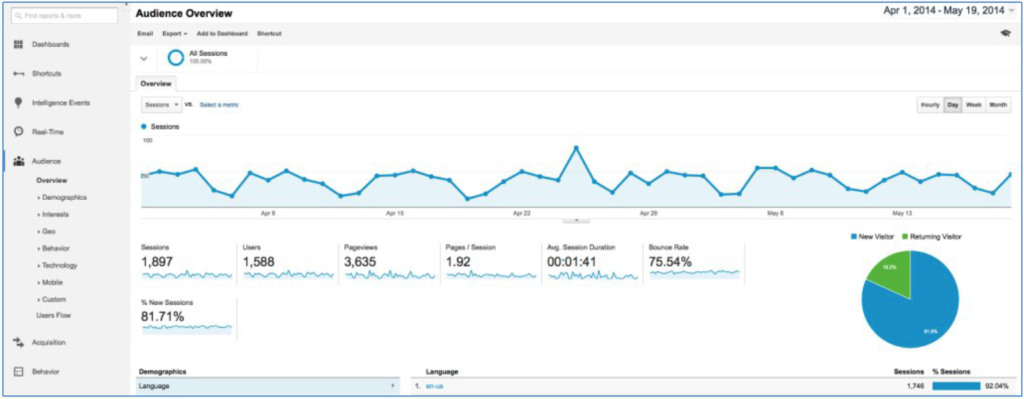
When you’re in charge of a website or its social media, how can you tell how many people are visiting your site and where they are coming from? If you haven’t already, the first step in that process is talking with your website developer and getting Google Analytics up and running on the site. This free tool allows you to stay up to date on the overall health of your website and how search engines and users are interacting with it. Let’s assume for the purposes of this article that you’ve already set up Google Analytics and are ready to hit the ground running. When you log into Google Analytics, you’ll see a dashboard that lists all of your current websites. Click on the website you want to dive into to get to a basic Audience Overview screen:
Audience Overview
From here, you can see traffic trends by hour, day, week, or even month. You can set a date range for the overview, and even see basic demographics, browsers, and operating systems of your site’s visitors. The screenshot above tells me a few things right off the bat: traffic dips almost every single weekend, most users are from the U.S., and there was a significant spike in traffic on Friday, April 25th.
But what, exactly, caused that traffic spike?
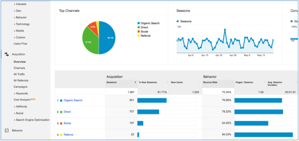
The first step is to get a general idea of what traffic is like on a normal day and then do a few comparisons. Let’s start with the easiest: Traffic. My average daily visits to the site (not including Saturdays and Sundays) fall somewhere between 40 and 50. On the day of the spike, however, those visits rose to 83. That means I’m looking for a difference of about 30 visits. My next step is to select the “Acquisition” tab in the left-hand sidebar and go to “Overview.” This breaks down traffic into four categories: Organic Search, Social, Direct, and Referrals. About half of my traffic comes from organic search, with Direct Traffic as the next largest source (37%). Following that are Social Referrals (9.9%) and Referral Traffic (2.7%).
Traffic Sources
Now let’s compare. Go back to the Audience Overview and select the date(s) of the spike.
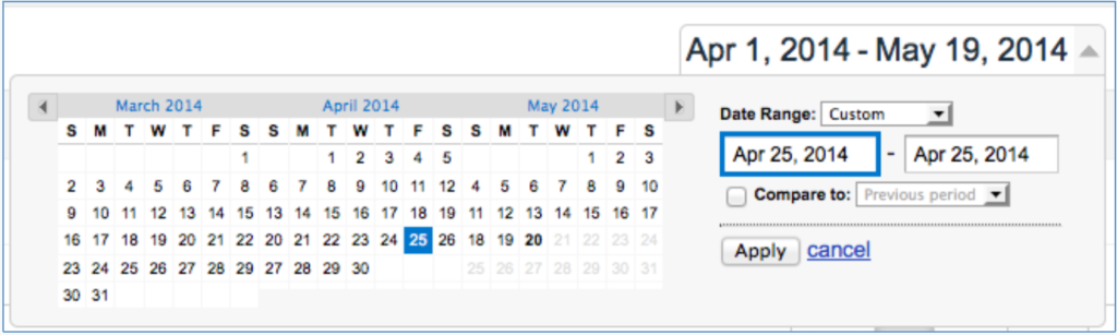
Date Range
You should just see a single blue dot to indicate where traffic was on that day; if the spike occurred over multiple days, you’ll have a graph similar to the “overview.” Selecting the “Hourly” view will show me what time visitors came to the site that day. In this case, it looks like the spike started between 8:00 and 9:00 AM:
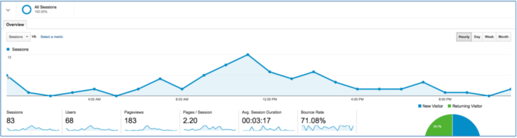
Hourly traffic breakdown
Now let’s swing back to the Acquisition Overview section and see what the differences are:
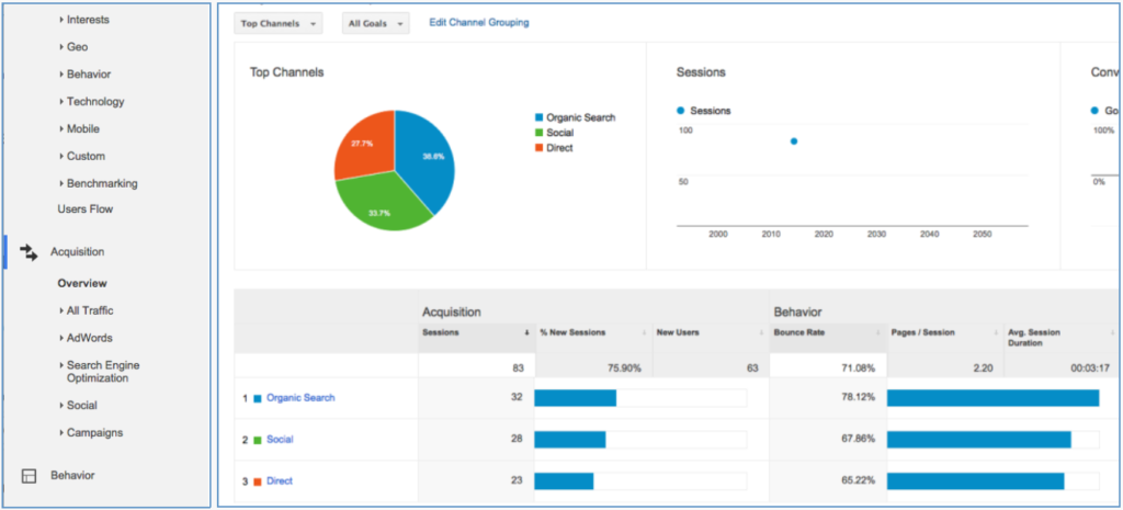
Acquisition Overview
Whoa! Do you see what I see? This graph looks completely different—which means that I have an indicator for where I need to focus my microscope. I’m looking for a spike, so that rules out Organic Search and Direct Traffic as the major culprits, since those percentages both decreased. That leaves just one category: Social Referrals. On average, 9.9% of the site’s traffic comes from Social. But on this day, a whopping 33.7% of traffic came from social, which means people really liked something posted there. All right, now that I know Social is the culprit, let’s check into that more. Click on “Social” in the Acquisition chart below the pie graph. This will take you to a breakdown of which channels brought you traffic. Clearly, we have a winner:
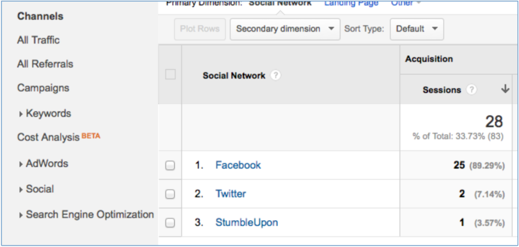
Social Referrals by Source
Now, Facebook is a little more complicated because it doesn’t assign a unique referral path like Twitter does—meaning I can’t see the exact post that brought people to the site. But what I can do is see where people are going and when. Click on “Facebook” to have GA only show you information about referrals from that site. To see what users’ landing page on the site was, select “Secondary dimension” at the top of the chart. Next, click on “Behavior,” followed by “Landing Page.”
-
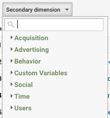
- First, select “Secondary dimension.”
-
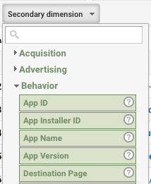
- Next, click on “Behavior.”
-

- Finally, choose “Landing Page.”
Again, there’s a clear winner here: an article written by Megan on April 24th about dealing with negative comments and reviews brought the site 17 new visitors, which makes up the majority of the traffic spike. You can also set the secondary dimension to map out the visits by time or (in the case of a multiple-day spike) day. This process could be used on any of the core traffic channels. For social, it tells me which posts people actually liked enough to click on. If Organic Search had been the culprit, I could have seen which pages it was bringing people to—even if it gives me only “not provided” search query keywords. For Referrals, I could see which sites and specific URLs are linking to me and to which pages.
Another interesting place to look when analyzing traffic is on the behavior flow chart… but that’s a different topic for a different day. For now, I’ve found my answer to where my traffic spike came from. The next step for me would be to analyze social to find out if that post had more engagement than normal and, if so, why. Google Analytics is a fantastic free tool to use, but it can certainly be overwhelming if you’ve never used it before. I hope that this tutorial helps, and if you have any further questions I hope you’ll reach out to us on social media or through email.